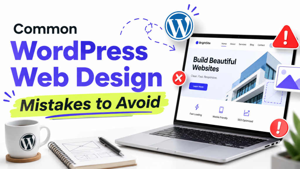
If a WordPress site feels difficult to use or a little unfinished, these are the eight design problems I would check first.
They include inconsistent styling, a crowded homepage, poor mobile layouts, slow pages, unclear calls to action, hard-to-read content, confusing navigation, and basic accessibility issues.
Most do not require a redesign. Fix the problems that make the site harder to use first, then clean up the smaller visual details.
1. Using too many fonts and colors
The problem is not that you crossed some exact limit. It is inconsistency.
If every section uses a different font, button color, or heading style, the site starts to feel unfinished.
For most websites, one or two font families are enough. Keep your colors limited too, then use the same choices consistently for text, backgrounds, links, buttons, and accents.
If you use a block theme, set your main fonts and colors under Appearance → Editor → Styles instead of restyling individual blocks one by one.
I would fix consistency before worrying about whether you have exactly two fonts or three colors.
For more help, see our guides to WordPress typography basics and choosing a website color palette.
2. Putting too much on the homepage
A homepage does not need to show everything your website offers.
The real problem starts when several sections compete for attention and visitors cannot tell what matters most.
Decide what you want the homepage to do. That might be:
- Introduce your business
- Send people to your services
- Show your best work
- Get newsletter signups
- Help readers find your latest content
One or two main goals are usually enough.
I would rather have a shorter homepage with a clear purpose than a long one where every section is trying to get attention.
If you are still setting yours up, see our guide on how to set a homepage in WordPress.
3. Designing only for desktop
A page can look fine on your laptop and still be difficult to use on a phone.
Before publishing, open the actual site on your phone. Do not rely only on the WordPress editor preview.
Check for:
- Text that is difficult to read
- Buttons that are hard to tap
- Images running off the screen
- Large gaps between sections
- Menus that are difficult to open
- Columns that do not stack well
Important buttons and controls should also be large enough to tap comfortably. WCAG 2.2 uses 24 × 24 CSS pixels as its minimum target-size criterion, with some exceptions.
If you use a page builder or blocks with device-specific settings, check those too.
Mobile design is not just a smaller desktop layout. The page still needs to be comfortable to read and use.
See our guide on how to make a WordPress theme mobile-friendly for more help.
4. Ignoring page speed
A good-looking site is still frustrating if pages take too long to load or respond.
Start with Google PageSpeed Insights instead of guessing.
For a typical WordPress site, I would check:
- Large images
- Page caching
- Heavy plugins
- Theme scripts and styles
- Fonts
- Hosting
Do not assume the theme is automatically the problem. A simple theme can still feel slow if the homepage contains huge images or several heavy third-party scripts.
Performance also contributes to the overall page experience Google considers in Search, but speed alone does not determine rankings.
If your site feels slow, our guide on why a WordPress site is slow walks through the main causes in order.
5. Making the next step unclear
Not every page needs a large button, but important pages should make the next step obvious.
A service page might lead to Get a quote. A product page might lead to Buy now. A blog post might point readers to another useful guide.
The problem is when several actions compete equally for attention.
If a page asks visitors to book a call, download a guide, and join a newsletter all at once, none of those actions feels particularly important.
I prefer one main call to action per page, with secondary actions kept less prominent.
The wording matters too. View pricing tells people more than Learn more.
For landing pages, see our guide on writing better landing page copy.
6. Making content hard to read
Long paragraphs are not automatically bad. The problem is making readers work too hard to follow the page.
Use headings when the topic changes. Keep paragraphs focused on one idea. Use lists when a list is genuinely easier to scan.
Also check:
- Line length
- Line spacing
- Font size
- Text contrast
- Space between sections
Do not break every sentence into its own paragraph just to create more white space. That can make an article feel just as awkward as a wall of text.
Someone should be able to scan the page and still understand how the information is organized.
7. Making navigation harder than it needs to be
Your main navigation should stay predictable from page to page.
Do not bury important pages under vague dropdown labels or change the menu structure without a clear reason.
Use labels people understand immediately, such as:
- About
- Services
- Blog
- Pricing
- Contact
A clever menu label is not useful if visitors have to guess what it means.
For classic themes, navigation settings may appear under Appearance → Menus. Block themes usually manage navigation through Appearance → Editor.
Your menu does not need to be tiny. It just needs to make the important parts of the site easy to find.
See our guide on how to add a navigation menu in WordPress if you need help setting one up.
8. Treating accessibility as an afterthought
Accessibility problems are often usability problems too.
Low-contrast text is difficult to read. Small controls are difficult to use. Images that communicate important information need a useful text alternative for people who cannot see them.
Do not add descriptive alt text to every image automatically.
Images that communicate useful information should have alt text that explains what matters. Decorative images usually do not need a spoken description and can use an empty alt attribute instead.
Also check color contrast. WCAG AA calls for at least 4.5:1 for normal text and 3:1 for large text.
The WebAIM Contrast Checker is a quick way to test this.
I would not leave accessibility until the site is finished. It is much easier to make good choices while you are building each page.
What I would fix first
If the site already exists and you are not sure where to begin, I would use this order:
- Make sure the site works properly on mobile.
- Fix anything that makes pages hard to read.
- Simplify confusing navigation.
- Test and improve page speed.
- Make the main action on important pages clearer.
- Clean up inconsistent fonts, colors, and spacing.
- Check basic accessibility issues.
You do not need to redesign the whole site because a few things feel wrong.
Fix what makes the site harder to use first. The smaller visual decisions are much easier to judge after that.