Pull up your site on your phone right now. Is the text readable without pinching? Do the buttons feel tappable? Does anything spill off the edge of the screen?
More than half of all web traffic comes from phones, and Google now judges your site based on its mobile version first. So if your theme looks great on a laptop but cramped on a phone, you’re losing visitors and search rankings at the same time. Learning to make a WordPress theme mobile-friendly fixes both.
The good news is that most free themes are already responsive, meaning they adjust to smaller screens automatically. But “responsive” and “actually pleasant to use on a phone” aren’t always the same thing. In this guide, I’ll show you how to make a WordPress theme mobile-friendly by checking your site and fixing the most common problems, no coding required.
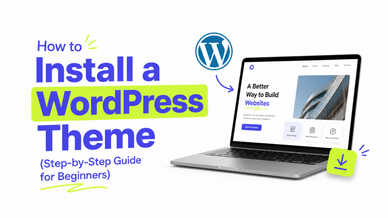
Just getting started with your theme? Our guide on how to install a WordPress theme covers the basics first.
How to Make a WordPress Theme Mobile-Friendly: Test First
Before you change anything, see what your visitors actually see. You have three easy ways to check.
Use the WordPress Customizer preview. Go to Appearance → Customize, and look for the small device icons at the bottom of the panel. Click the phone icon to preview your site at mobile size instantly.
Use your browser’s built-in tools. On a desktop, right-click your page, choose Inspect, then click the device-toolbar icon to simulate different phone screens. It’s the fastest way to test lots of sizes.
Use Google’s PageSpeed Insights. Google retired its standalone Mobile-Friendly Test back in December 2023, so the current tool to reach for is PageSpeed Insights. Enter your URL and it shows how your page performs on mobile, including loading speed and layout issues, which is exactly what Google now uses to judge your site. For a deeper audit, the Lighthouse tool built into Chrome (under the browser’s DevTools) checks mobile usability, performance, and accessibility in one report.
Check on a real phone too if you can. Simulators are close, but nothing beats holding the actual thing.
Fix 1: Make Sure Your Theme Is Responsive
If your theme isn’t adjusting to small screens at all, that’s the root problem, and it’s worth solving before anything else.
Almost every theme in the official WordPress directory is responsive by default, including all the ones in our roundup of the best free WordPress themes. If yours isn’t adapting, it may be old or poorly built.
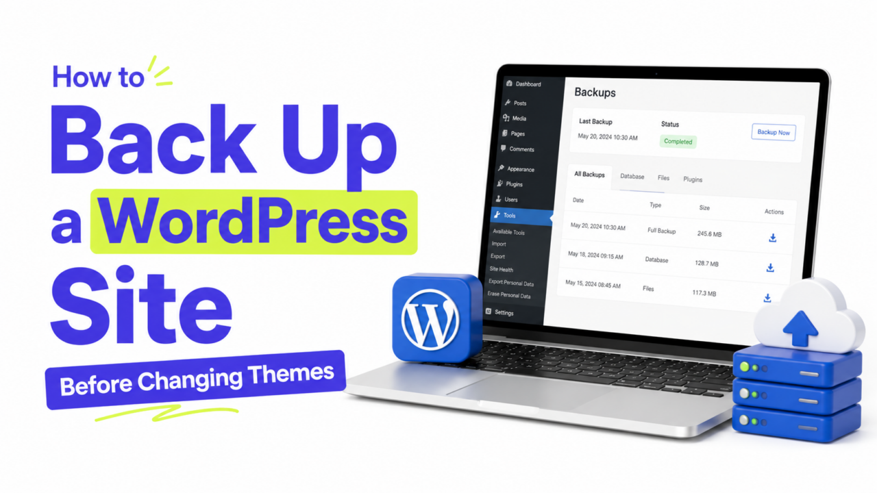
The cleanest fix is to switch to a modern, lightweight theme that handles mobile properly out of the box. It sounds drastic, but it saves you from patching a theme that’s fighting you at every step. Just back up your site first.
Fix 2: Size Your Text for Small Screens
Tiny text is the fastest way to make a phone visitor bounce. On mobile, aim for body text of at least 16px so nobody has to zoom in to read.
Many themes let you set font sizes right in Appearance → Customize under Typography or Fonts, often with a separate control for mobile. Bump the mobile size up if your text feels small on a phone.
For more on choosing and sizing fonts, see our typography basics guide. Also check your line length and spacing. On a narrow screen, generous line height (around 1.5) makes paragraphs far easier to read than text that’s packed tightly together.
Fix 3: Make Buttons and Links Tappable
On a desktop, a mouse pointer is precise. On a phone, people use their thumbs, and thumbs are not precise.
Make sure your buttons and links are big enough to tap without zooming. A good rule of thumb (literally) is a tap target of at least 44 by 44 pixels, with a little space around it so people don’t hit the wrong link by accident.
If your theme’s buttons feel cramped on mobile, check the Customizer for button size or padding options. Many themes include them.
Fix 4: Simplify Your Mobile Menu
A menu with eight items looks fine across the top of a desktop screen. On a phone, it either wraps into a mess or gets crammed into a tiny “hamburger” icon.
Most responsive themes automatically collapse your menu into that hamburger icon on mobile, which is exactly what you want. To keep it clean:
- Trim your main menu to the essentials, five or six items at most.
- Move secondary links (privacy policy, terms) to the footer instead.
- Test the menu on a phone to make sure it opens and closes smoothly.
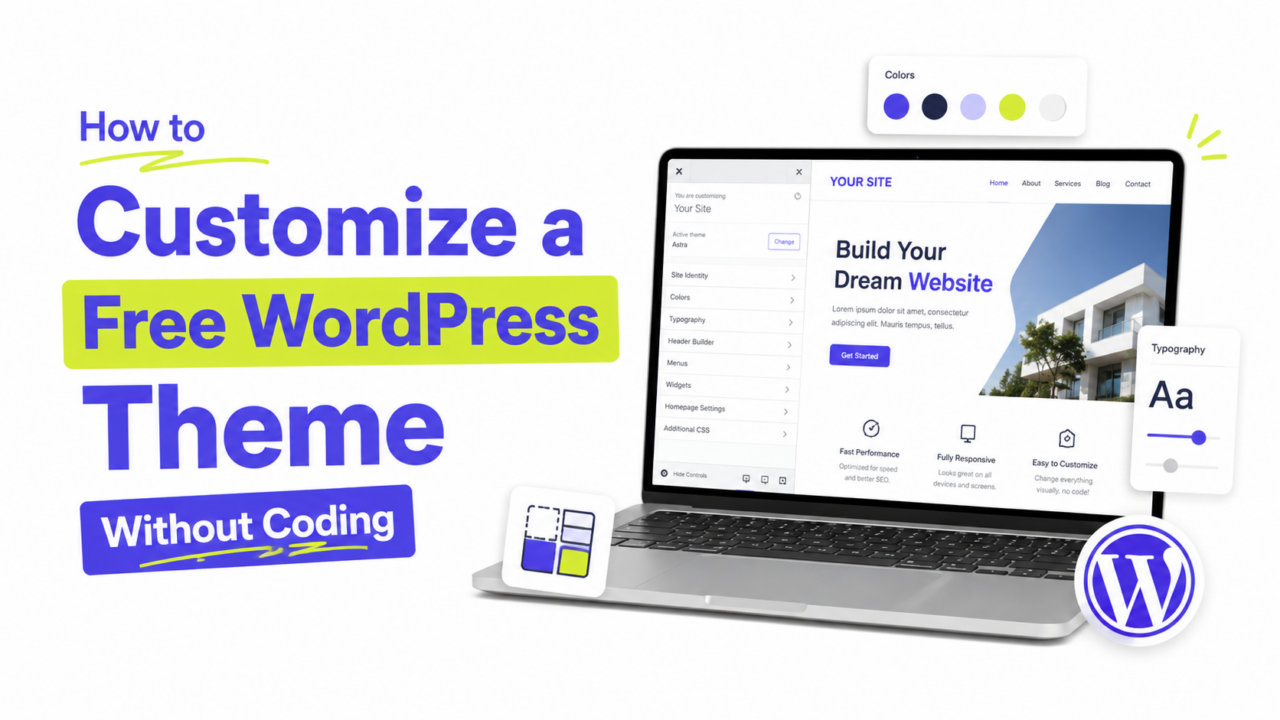
If you want to rework your menu structure, our guide on customizing your theme without code walks through it.
Fix 5: Check Your Images and Media
Big images are the number one cause of slow mobile pages, and slow pages lose visitors fast.
- Compress your images before uploading with a free tool like TinyPNG, or a plugin like Smush. Our full guide on optimizing images in WordPress covers the details.
- Avoid oversized images. A photo that’s 4000 pixels wide is overkill for a phone screen. Resize before uploading.
- Watch embedded content. Videos, maps, and social embeds should scale down to fit. Most do automatically, but test them.
Faster images help your mobile speed and your Core Web Vitals, both of which feed into your Google rankings. For the full picture, see our guide on how to speed up a free WordPress theme.
Fix 6: Add Extra Control With a Plugin (Optional)
If your theme’s built-in options don’t go far enough, a plugin can help. Page builders like the free version of Elementor let you adjust padding, font sizes, and even hide specific elements on mobile, all visually.
Use this sparingly, though. Every plugin adds a little weight, and the goal here is a faster mobile site, not a slower one. Reach for a plugin only when the Customizer genuinely can’t do what you need.
A Few Common Questions
1. How do I know if my theme is mobile-friendly? Run your site through Google’s PageSpeed Insights (which replaced the retired Mobile-Friendly Test), or preview it using the phone icon in the WordPress Customizer. Both show you quickly whether your site adapts to small screens.
2. Do I need a separate mobile theme? No. Modern responsive themes handle every screen size with a single design, so a separate mobile theme is outdated and unnecessary. One good responsive theme does it all.
3. Why does my site look fine on desktop but broken on mobile? Usually it’s oversized images, text that’s too small, or a menu that doesn’t collapse. The fixes in this guide cover all three of the most common culprits.
4. Does mobile-friendliness really affect SEO? Yes, and significantly. Google uses mobile-first indexing, meaning it primarily looks at your mobile site to decide your rankings. A poor mobile experience can hold back an otherwise great site.
Win the Mobile Majority
Making a WordPress theme mobile-friendly mostly comes down to a few sensible habits: pick a responsive theme, size your text and buttons for thumbs, keep your menu tidy, and compress your images. None of it requires code, and all of it pays off in happier visitors and better rankings.
Start by testing your site on a phone today. Once you see what your mobile visitors see, the fixes above will be quick to apply, and worth every minute.