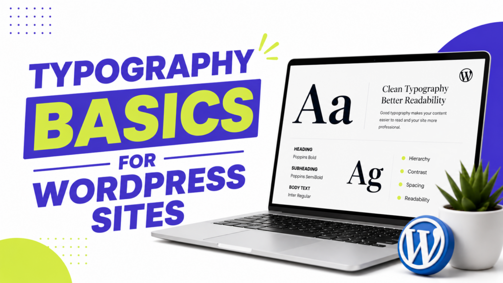
Typography is the quiet workhorse of good web design. You rarely notice great typography, but you always feel bad typography, cramped lines, fonts that clash, text you have to squint to read. Get it right, and your site feels effortless to read. Get it wrong, and people bounce before your words get a chance.
The best part? Good typography isn’t about talent or expensive fonts. It’s about following a few simple principles, most of which you can set up in your theme in minutes. In this guide on typography basics for WordPress, I’ll walk you through choosing fonts, sizing them, pairing them, and applying it all. Let’s get into it.
Setting up your site’s look? Our guide on customizing a free theme without code covers where these settings live.
Typography Basics for WordPress: Use No More Than Two Fonts
The fastest way to make a site look messy is piling on fonts. The clean, professional approach is simple: one font for headings, one for body text. That’s it.
Even simpler, you can use a single font family throughout and just vary the weight and size. Plenty of polished sites use one well-chosen typeface for everything.
Two fonts give you a bit of contrast and personality. Three or more starts to look like a ransom note. When in doubt, keep it to two.
Rule 2: Prioritize Readability Over Style
That gorgeous decorative font might look amazing on a poster, but if people can’t read your paragraphs, it’s working against you. For body text especially, readability beats personality every time.
A few readability essentials:
- Body text size: at least 16px, and 18px is even better for comfortable reading.
- Line height: around 1.5 to 1.6 for body text, so lines have room to breathe.
- Line length: aim for 50 to 75 characters per line. Text that stretches edge-to-edge is tiring to read.
- Contrast: dark text on a light background is the most readable combination.
Save your expressive fonts for headings, where they add character without hurting readability.
Rule 3: Pair Fonts That Complement Each Other
Good font pairing usually means combining fonts that are different enough to create contrast, but not so different they clash. A common formula is pairing a serif with a sans-serif.
Here are beginner-proof pairings that work, all available free on Google Fonts:
- Inter + Merriweather (clean sans headings, readable serif body)
- Poppins + Lora (modern, friendly)
- Roboto + Playfair Display (versatile body, elegant display headings)
- Montserrat + Open Sans (professional and safe)
- Nunito Sans + PT Serif (soft and approachable)
If pairing feels overwhelming, don’t stress: use one of these, or just pick a single versatile font like Inter or Roboto for everything. You genuinely can’t go wrong keeping it simple.
Where to Find Fonts (Free)
You don’t need to buy fonts. The best free source is Google Fonts, with hundreds of high-quality, web-optimized typefaces that load fast and work everywhere.
Most modern WordPress themes let you pick Google Fonts directly in their settings. If yours doesn’t, a free plugin like Fonts Plugin (Google Fonts) adds the option without any code.
One speed tip: loading lots of font weights can slow your site down. Stick to two or three weights (say, regular, bold, and one heading weight) rather than loading the entire family.
How to Change Fonts in WordPress
Applying your fonts takes just a few minutes.
On a classic theme: Go to Appearance → Customize and look for Typography or Fonts. You can usually set separate fonts for headings and body text, and adjust sizes, some themes even have a dedicated mobile size control.
On a block theme (like Twenty Twenty-Five): Go to Appearance → Editor → Styles → Typography to set fonts and sizes site-wide with a live preview.
For fine-tuning that the theme options don’t cover, custom CSS handles the rest. Our guide on adding custom CSS to any free theme walks through targeting specific text.
Don’t Forget Mobile
More than half your readers are on phones, so check your typography on a small screen. Text that looks fine on a desktop can feel cramped on mobile.
Make sure your body text stays at least 16px on phones (smaller and people have to zoom), and that your headings don’t overflow their lines. Our guide on making your theme mobile-friendly covers the details.
A Few Common Questions
1. How many fonts should I use on my website? Two is the sweet spot: one for headings, one for body text. You can even use just one font family and vary the size and weight. More than two tends to look cluttered.
2. What’s the best font size for body text? At least 16px, with 18px being even more comfortable to read. Pair it with a line height of about 1.5 so your paragraphs don’t feel cramped.
3. Where can I get free fonts for WordPress? Google Fonts is the go-to, with hundreds of free, web-ready typefaces. Many themes let you select them directly, or you can use a free plugin like Fonts Plugin.
4. How do I change fonts without coding? Use your theme’s built-in options: Appearance → Customize → Typography on classic themes, or Appearance → Editor → Styles → Typography on block themes. No code needed.
Type That Reads Beautifully
Good typography comes down to restraint: two fonts at most, readable sizing, comfortable spacing, and a sensible pairing. None of it requires design training, and most of it takes minutes to set up in your theme.
Start by picking one solid font pairing from the list above, set your body text to at least 16px, and check it on your phone. Those three moves alone will make your site noticeably more pleasant to read, which keeps visitors around longer. Clean type matters even more on minimalist WordPress themes, where design leans on typography. Not sure how to apply a new font? See our guide on changing fonts in WordPress.